
 So without further ado, I give you the dress that caught my eye:
 Final Verdict: Pure elegance... and for only $3500 it can be yours. Also, those sexy nude strap sandals don't hurt either.
 So without further ado, I give you the dress that caught my eye:Final Verdict: Pure elegance... and for only $3500 it can be yours. Also, those sexy nude strap sandals don't hurt either.

 Sure, this may be difficult to keep clean, but you could try to not spill things on yourself. The two looks above by Rugby show how well this "it" color blends with other spokes on the color wheel. I know that sometimes I have a tendency to focus on the more preppy styles, so let me show you a few couture designers who have used this as inspirations for their spring 2011 collections.
 Donna Karan exhibits some casual sophistication with her cuffed cotton shorts.
 The Italian fashion house, Etro, uses a striped gradient on their cardigan.
 Giambattista Valli, hailing from Paris, takes it dressy with their Sangallo strapless dress.
 And finally, Burberry Prorsum takes it to modern comfort-town with their raw-edge tee (paired with their new alpaca-silk blend trench... also in grey I might add).
 Pitti Uomo, the fashion trade show in Florence, is showing for the next season, but my favorite viewings are the amazing photos taken by all of the photo-bloggers waiting like vultures outside the venues. They silently circle the crowds of perfectly-dressed buyers and editors, waiting to pounce on the perfect shot. More often than not, I find that these stylish crowds can serve as indicators as to what trends we may see. This year I noticed a few distinct trends (captured by famed photographer, Tommy Ton).
 The first thing that I noticed from this year's crop of shots was the bold mixing of patterns. In many instances they took 3 completely different patterns and put them together in a way that blends perfectly. This will be the sartorial test that weeds out the fashion masters from the novices. This advanced level of coordination takes a very keen eye and an excellent grasp of fabrics, patterns, and colors. See a few of my favorite examples below.
 Another trend that I see has continued from this season is the statement sock. However, I noticed more of a leaning towards the blue/green side of the color wheel vs. the yellows and oranges we saw this past fall. I especially like the robin's egg blue that is shown in one of the shots below.

 The last trend that I will share with you that I noted is the change in the denim. My wife was actually ahead of the curve and predicted perfectly with a new pair of jeans she got me for my birthday. We are seeing a little bit of a shift from the very dark solid washes to options with a little bit of character. This can be anything from the lighter "mid-western" washes, to indigo washes with a bit of additional fading like the ones directly below. These pants tend not to be overly destroyed, as many of the editors are pairing them with sport coats and tailored blazers. Think less Hollister, and more classic Adriano Goldschmied.

 Final Verdict: Keep your eye out for some of these variations and options from retailers this season as they clear out their inventory this January and even into February.
 Final Verdict: Why keep others in the dark? Tweet them some helpful fashion tips.
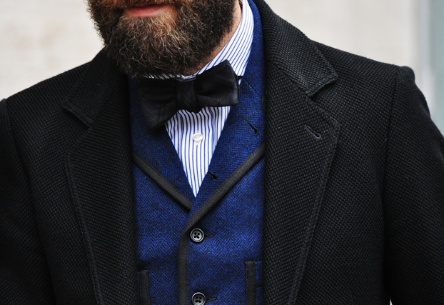
 After the holiday buzz has died down and trash cans are full of fallen evergreen needles, how does one dress? One thing that I've noticed over the last several years is that January seems to be a month for black and charcoal. It's kind of funny when you think about it, as January is all about new resolutions and another chance at life. You'd think people would be trying to put a little color into their outfits to signify their new resolve, but instead we gravitate towards the morose. Perhaps it is because we know that, much like the leaves of summer, most of our resolutions will fall and die... so on our part we subconsciously engage in preemptive grieving.
 As odd as it seems, the dark tones do look great contrasted by the occasional snowfall and concrete frost of the urban scenery. One way I try to add a little life to my outfit is to bring out the rich wine shades or regal purples. These accents look great with either black or charcoal and tend to work with most skin tones... even the deathly winter pallor.
 Final Verdict: Embrace the tried and true morbid tones, but try adding a violaceous pop.
 Whew, like many of you, I have been running around like crazy trying to complete my laundry list of holiday activities. In between writing cards, shopping, wrapping, working, attending parties, hosting guests, and a myriad of other time-occupiers, I've somehow come up with some more helpful tips. Attending all these parties has made me realize that perhaps some of you could use a little refresher on what to wear to a holiday-themed event.
 The end goal of your festive ensemble should be to evoke holiday cheer without looking like a plastic lawn ornament. Unless your party tells you to come dressed with tacky reindeer horns attached to a velvet headband, please refrain. Instead, reflect the Christmas season with a little tartan. Now, I started to look around for reasons why tartans have become a winter wonderland staple, but I couldn't find a definitive answer. Instead of sharing the history, let's just focus on some various ways to work in these festive patterns.
 There are quite a few holiday tartans, so you can find colors to work with just about anything that you have in your closet already. The most classic of checks usually focus on a green or red base, but don't feel limited by these constraints. For example, the Black Watch tartan is a very muted pattern that is often considered to be acceptable in some formal situations which makes it a great jumping off platform for the holiday season. You don't have to start with a plaid tux jacket, but you might work it in subtly, for instance with knee high socks (for females), a pocket square (for men), or a tie (for either).
 For a little bit bolder of a choice you can start to mix in the rich reds of a Stuart Tartan or a Buffalo Check. These will certainly make you stand out, but if successfully executed will make you the buzz of the party. When going for a statement piece try to keep the rest of your ensemble understated.
 Final Verdict: Remember to not overdo it. Be more like the Mona Lisa, in that people just like looking at you but they really can't put their finger on why.
 So for all of you out there in reading land who wondered where I went for 4 days, I was working on the next batch of rakish articles. Fresh off the press we have an article about the dress shirt. Strike that, the dress shirt actually has a very minimal role to play in this post. I am more concerned with pairing it with its eternal mate: the tie. Personally, I really don't understand why this is such a hard concept, but what I have noticed over the last 5 years or so is that men (and even about 50% of women) seem to have difficulty blending the two. Of course, I'm not talking about pairing a basic tie with a solid shirt. I am referring to matching patterned shirts with patterned ties. This can be anything from stripes on stripes to matching a wide checked shirt with a smaller checked tie. In general, the main concept that you have to consider when matching is the rule of 3. This simply refers to the fact that 2 out of 3 things that you are wearing can be the same pattern. For example: if you are wearing a pinstriped suit. then either your tie or your shirt can be striped, but not both. When it comes to patterns, you want to watch that the patterns aren't too similar in size. This goes with stripes as well. The stripe widths need to be different or it looks too much like you cut a piece of your tie/shirt/suit and made the other striped piece. For checks on checks, I often opt for a large box check for the shirt and use a smaller pattern for the tie. Sometimes it is nice to mix up the direction of the checks as well. A small diamond shape on the basic windowpane is a nice classic look.
 If you really have a lot of trouble with the matching, pick up a magazine and cut out the pictures that you like and use them for shopping. In a 2008 interview with the CEO of Armani, one of the main things talked about was how he found it ridiculous that men refused to use their resources for shopping. There is nothing wrong with taking your favorite advertisements and trying to replicate them within your wardrobe. I know you love Michael Bay, but those Victoria's Secret ads aren't going to help you become better dressed... just put those back. Another helpful tip is to find a sales associate who seems to be very knowledgeable and take their advice... unless of course you hate what they are wearing. When worse comes to worse, just shop off the mannequins. They are probably "store set" which means that they were picked out by people with a degree in visuals or who at least seem to have "good taste."
 Finally, what is the deal with men only knowing how to tie one knot? Are you kidding me? Every man should learn how to tie, at the bare minimum, the basic three knots. Each has a different time to be used. I've found that most men learned how to tie the only knot that they know from their father. There is nothing wrong with that, but one knot doesn't fit every situation. Oh, and if you are the kind of man that leaves your tie tied when you are not wearing it, please stop. For the love of all that is good in this world of fashion, please stop. All that does is press permanent wrinkles into the tie. So back to the knots...the first knot that we come to is the four-in-hand. This is the simplest of options and leaves the smallest result. It is used with forward point and button down shirts. Next we come to the half-windsor. This is the lazy brother of the Windsor knot but works well when the larger knot just doesn't seem to fit. Finally, the full windsor knot (named after the Duke of Windsor) is the most elegant knot and, as consequence, the most formal. Regardless of what type of knot you tie, the dimple must be present in the tie just below the base of the knot. This "crease" should be centered and pulled tight.